Skip to main content
Search
Search This Blog
Appliedeconomist.net
Share
Get link
Facebook
X
Pinterest
Email
Other Apps
May 29, 2017
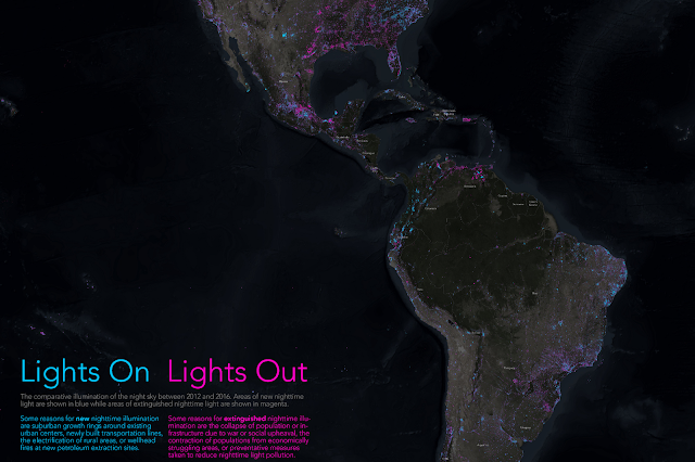
World's sky-night lights
Really
amazing map
comparing the NASA night-sky world map from 2012 against 2016. You can zoom in!
Blue means more lights, purple fewer lights.
Comments
Popular Posts
January 01, 2014
GDP per capita by language
February 22, 2022
Information impact on Market Performance


Comments